Roots
Client: Design Lab
Year: 2024
Role: UX Researcher, UX/UI Designer
Toolkit: Figma, Adobe Fresca, Pencil & Paper
Despite the common knowledge of moving, finding local restaurants, meeting neighbors, and fully immersing oneself in their new community can be challenging. Many spend a substantial amount of time before they feel connected to their local community. Roots is designed to regain that sense of community and allow users to have access to these needs at their fingertips.
Overview
Background
Roots is an end-to-end app where users can connect to their local community by:
- Meeting with others around them
-Finding local businesses
-Exploring local events, and attractions
key features
Explore
Events
Make
Connections
Explore
Attractions
Explore
Businesses
Explore
Restaurants
ux research
Methodologies Used
- Competitive Analysis
-User Interviews
Competitive Analysis
research Goals
We want to investigate user’s needs and wants when relocating to a new area so that we understand how they can feel more connected to their local communities.
User interviews
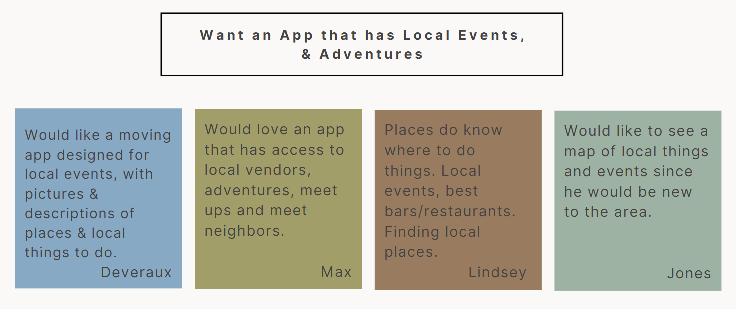
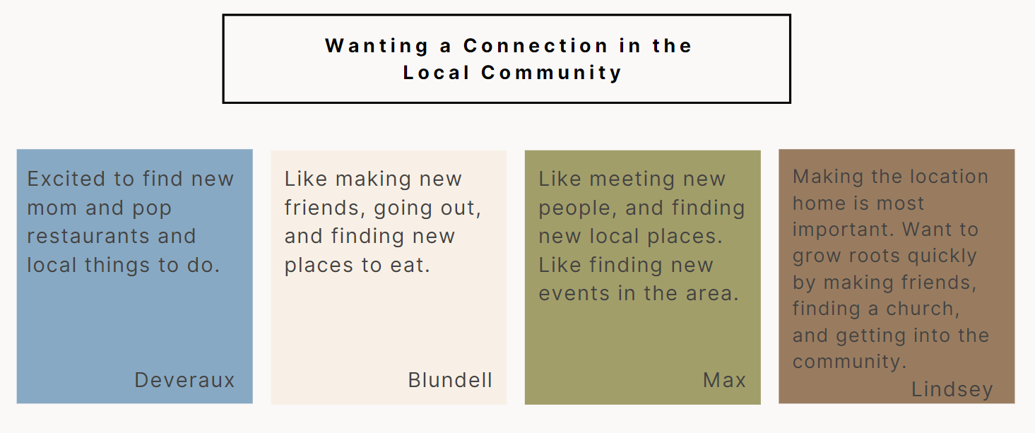
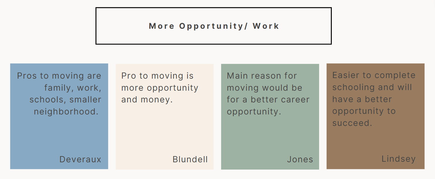
Affinity mapping
Key findings
-Building connections with others socially is important when moving to a new place.
-Having accessibility to local businesses, restaurants, events, and attractions in the area is the top priority.
User personas
UX DESIGN
Methodologies Used
project goals
While the business goals were mainly focused on attracting high user flow, the user’s goals were focused on the ability to connect and have ways to engage socially. The shared goals between both helped me to identify user’s needs, while comparing how these can overall affect the business as a whole.
Features roadmap
information architecture
I built a sitemap considering the primary, secondary, and tertiary navigation for the site. I began by creating my primary navigation by defining what main actions needed to be taken. The primary navigation consisted of: events, attractions, local businesses, and social. From there, I expanded upon the navigation.
User flows
-Creating your social profile
-Finding a local restaurant
task flows
-Creating your social profile
-Finding a local restaurant
wireframes
For my wireframing, I began by sketching out the signing-up flow. I narrowed what frames I believed to be the most crucial in the signing-up process and used these to further develop my low/mid-fidelity framework.
UI Design
BRAND IDENTITY
For the brand logo, I chose my primary color of green paired with a neutral gradient. I picked green as the main color due to its meaning. Green, amplifies the value of the brand and should be used as the main visual. The symbol I chose was roots. Roots symbolize growth, connection, and strength.
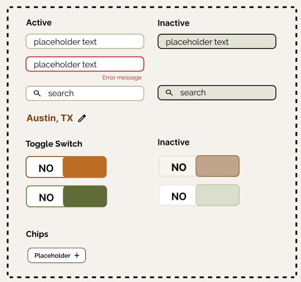
UI Library Components
My brand and visual choices were chosen based on my users. From my research with interviews, affinity mapping etc. I gathered an overall sense that my users were lacking a sense of community. They all stated they wanted away to connect with others, and their local community. From this information, I gathered unity and connection as my users needs/wants, and created the vision and values this brand would represent. The vision will be to create a safe space for individuals united by a common interest or characteristic to deepen & grow their communities. The values will be Relationships, Culture, Community, Connection, and Compassion. I needed to first understand my users' needs and gather this information to truly understand what design choices would be the most beneficial. For my brand and visual designs I researched what colors associate with these needs. I chose green due to its representation of tranquility, connection, generosity, read ability, and its feeling of growth. I chose orange due to its representation of optimism, adventure, creativity, collaboration, and confidence. These two colors were the main source of my color palette design. This is due to how these colors would bring visuals to my users. From there I took different gradients from both of these colors to create unity within my color palette and my components.
high- fidelity wireframes
USABILITY TESTING
PROTOTYPE
- Competitive Analysis
-User Interviews
PROTOTYPE
OUTCOME
Success Metrics
-Task rate: How many users successfully complete the tasks from start to finish. Users were able to complete the signing-up process smoothly without any errors or delays in navigation
-Completion time: How long it takes a user to complete a task. Users completed the task flows both effectively and quickly. It took a maximum of a few minutes to effectively complete the tasks.
-Error Rate: The percentage of users who make a mistake while performing each task. There were no errors in completing the tasks.
-Task Level Satisfaction: The user's rating of their satisfaction with the tasks and the product as a whole. Users experienced satisfaction the entire time they were interacting with the app.
Success
-Users were able to navigate the signing-up process smoothly from start to finish. Users all completed the tasks in under 2 minutes.
-Users found both ways to navigate to the edit profile screen. Completion time took less than a minute.
-All users found the event in less than a minute. They also found both ways to navigate to the task without any direction. Through both the top navigational bar and through the bottom explore icon.
-All users found the specific restaurant in under one minute. They were able to locate the restaurant through both the shortcut icon on the top navigation bar, and through the bottom navigational bar explore icon.
Issues:
-Grammatical issues were found that need to be corrected.
-Several user’s found the profile image being used for both editing and the home icon was confusing.
Positive Feedback:
-The overall color schematics, flow between screens, and navigation was easy to follow.
-Easy to navigate and find both ways to edit profile information. Minimal design makes it easy to read and understand.
-Very simple to navigate. Users also expressed the design was minimal, decluttered, and made navigation simple.
Recommendations for next steps
-Grammatical Errors. Fix grammatical errors on the signing-up task flow frames.
-Profile Icon. Edit the profile icon on the top navigational bar and the main profile icon on the home screen to differ in appearance. This will eliminate confusion to the user on the difference of each and where they lead.
The usability testing provided insight into how users navigate through the task flows they will experience when using the app. This insight allowed for discrepancies to be shown when watching how users navigate each task on their own. While, overall the task flows were all navigated quickly and effectively, a few things were shown to need further review. Grammatical errors in the signing-up process, and confusion between the profile and editing profile icon will be the next steps in the priority revisions.


